WEB
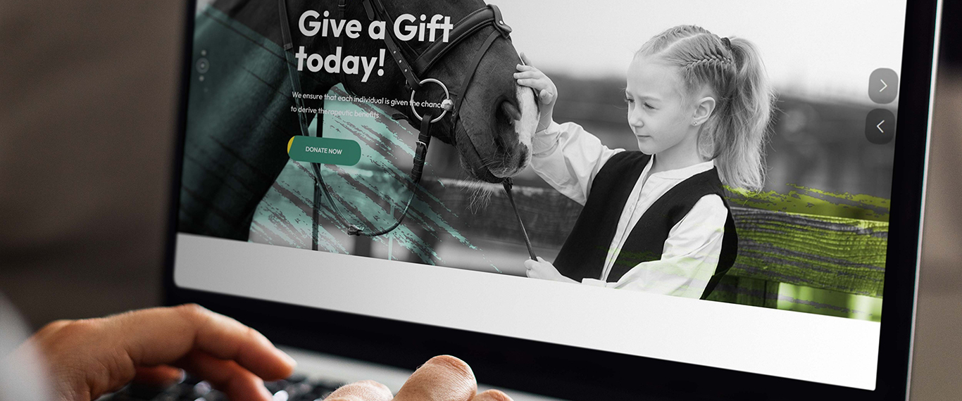
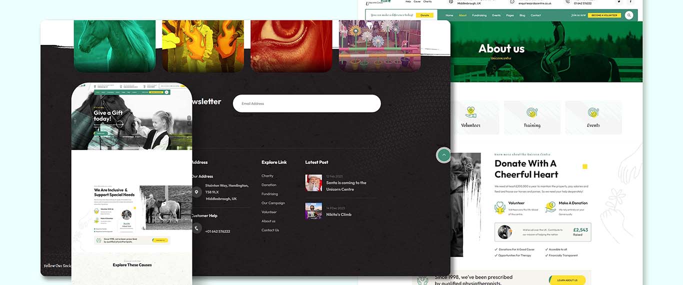
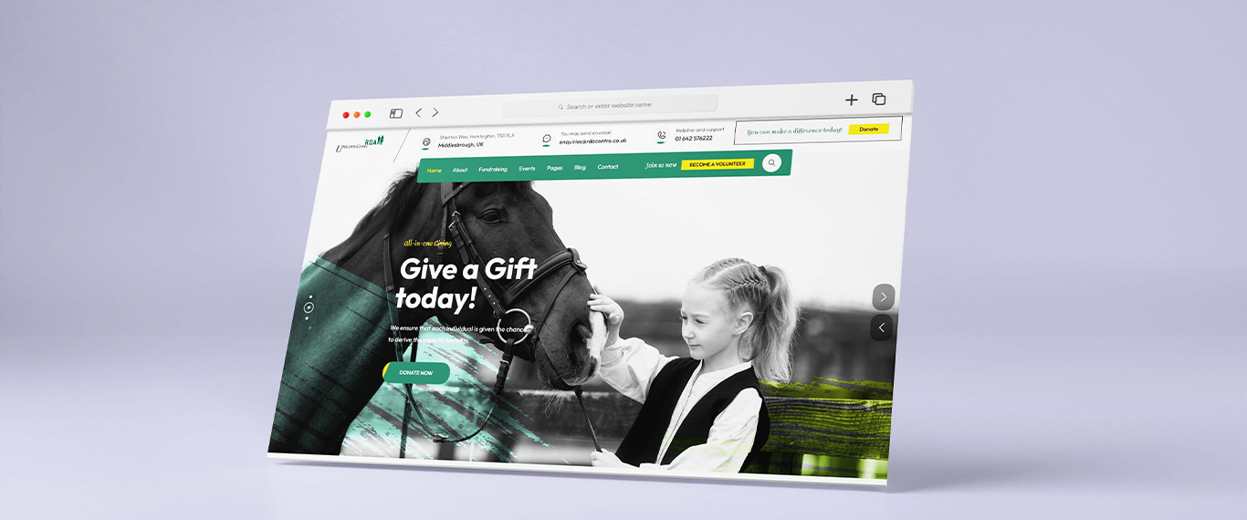
Approach: I kicked off with an in-depth discovery phase, engaging with various stakeholders to understand the unique needs of the audience. Leveraging this insight, I crafted an interface that emphasizes accessibility and inclusivity, incorporating features like text-to-speech, keyboard navigation, and adjustable text sizes. A warm, inviting color scheme reflects the organization's nurturing ethos, while high-quality imagery and videos bring the joy and transformation experienced by participants to the forefront.
Outcome: The redesigned website has been a beacon of positive change, significantly enhancing user engagement and interaction. Not only has there been a marked increase in donations and volunteer sign-ups, but the site has also become a central hub for sharing stories and connecting the community. By marrying functionality with heart, I’ve helped amplify their message and reach, furthering their mission to change lives through horse riding.
| Client: | Riding for the Disabled Associaiton |
| Medium: | Dreamweaver, Photoshop |
| Deliverables: | Web Design, Web Management |
For quite some time, we've faced challenges in finding a designer capable of perfectly blending our brand's colors. Pete has exceptionally met this challenge.
Pat White